You may have noticed a change to the main menu of Aiir, with new icons for your apps! They're simpler, cleaner and we hope make navigating the many options within Aiir a bit easier.
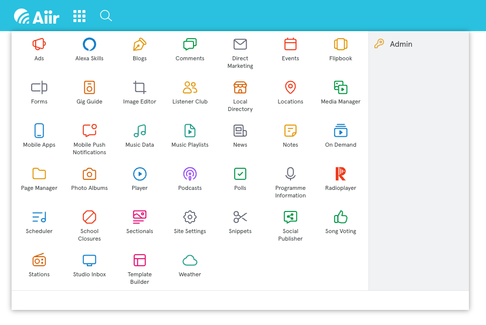
Since the start of this year, we've been gradually rolling out our new icon set across Aiir. You may have noticed small tweaks throughout - maybe the change of a + button, or icons within Site Settings.
There's still more places we'll be updating them in the coming weeks and months, but this update to the main app icons is probably the most notable change you'll see as part of this.
We decided to update the icons as part of our ongoing work to improve the look of the platform. They're built with a new technical approach that will allow us to launch some exciting new features which we'll hopefully be able to share more news about shortly. It also has given us the chance to refine their look, reduce some of the complexity and review the use of colours to improve accessibility.
Any change to something you use every day has the chance to be a bit jarring, so hopefully you've not been thrown too much by these. We've been trialing them for the last few weeks and they've settled in for us incredibly smoothly so we hope they do for you too.
If there's any issues, feedback or comments, we're always happy to hear from you - just let us know by emailing support@aiir.com.
We've introduced the new-look icons in Aiir as part of the launch preparations for our new web-based Music Scheduler. It'll sit alongside your existing tools for managing your websites, apps, Alexa Skills and Studio Inbox... and you'll be able to try it from May 19th!

