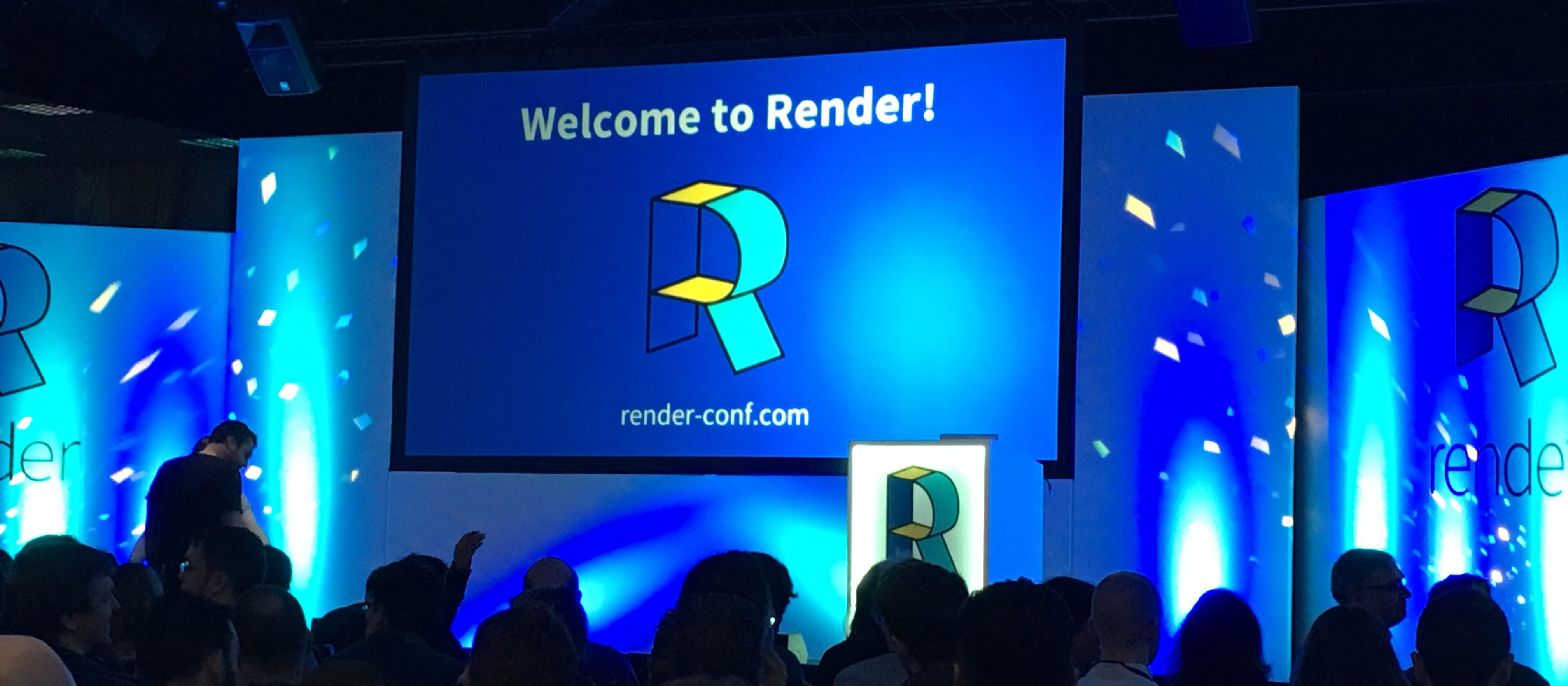
Last week I was fortunate enough to attend the 2017 Render Conference in Oxford. The event runs over 2 days and is one of the most popular conferences for front end developers in the UK.
The 19 brilliantly insightful talks over the two days took us on a journey from the origins of the web, to working with the web today and in the future. I want to focus on some points I found helpful and how we can use these points to change the way we think about web design.
What can we do right now to improve our sites?
Make sure everybody has the same browsing experience.
Accessibility on websites is often overlooked - as designers we need to ask ourselves 'are we forgetting some of our audience?'. Seren Davis took us through some important factors to consider.
Some of these can include using alt tags, making sure we using contrasting colours so that people can read our website and adding a scroll to top button for those who may have issues with scrolling too far. Many websites use capitalised text for titles or links, however don't realise that this hinders understanding from those with Dyslexia as they are unable to follow the outline of the letters. We can overcome this by using bold text instead of caps.

I have seen some sites that disable right clicks/highlighting to stop copyright infringement. Websites who do this need to stop as it negates the 'speech' function browsers have added specifically to help those who cannot read. Highlighting can also help people remember where they are at in an article, I do not suffer from sight issues and I still use this to my advantage!
Think twice and make sure everybody who visits your website has the same browsing experience.
Help pages load faster & slow down image rendering time
Although modern site designs use less imagery, they still make up a large percentage of web traffic. José M. Pérez took us through how we need to think proactively about how we can reduce load times and make our website an enjoyable experience for the viewers, as well as knowing when to use an image and when not to (gradients and shadows for example no longer need to be an image).
With Javascript we can add lazy loading to our sites; this checks to see if the viewport is showing an image, and only renders the image onto the page if it is true. This is particularly helpful for long web pages as it stops the page loading all images at once. Unfortunately display:none; isn't the best practice here as the browser will still request the image and then hide it. IntersectionObserver is still an experimental technology but is something hopefully we can look forward to using in the future.
Looking to the future - will our code base change?
Let's start using CSS Grid right now
Many designers use their own version of a grid system, whether it be Bootstrap or a bespoke layout. Rachel Andrew took us through a talk about CSS Grid; a new feature which is (almost) available in all browsers, and is ever so slightly different from Flexbox.
Whereas Flexbox is a one-dimensional layout, CSS grid is a two-dimensional layout allowing us to focus on styling rows and columns at the same time. Using it, we can easily create a functional grid on our website with minimal code. For example:
.box-feature {
   display: grid;
   grid-gap: 20px;
   grid-template-columns: repeat(6, 1fr);
}
.box-feature .box-image {
   align-self: stretch;
   justify-self: stretch;
   grid-column: 1 / -1;
   grid-row: 1 / 4;
}
This takes our container div (box-feature) and adds the grid styling to it, grid-gap works as spacing between items and grid-template-columns state how many fractions we want to use as available space in the container. In this example we are splitting our container into 6 columns.
We then need to target the individual elements inside the container to fit them into the grid. As you can see there are no widths being used here, We simply use grid-column and grid-row to state where the item starts and ends in the grid. In the case of box-image it starts at 1 (all the way to the left) and ends at -1 (to the right) so will take up the full width of the grid. The same process of styling is used on all children of the container.
In terms of older browsers, CSS Grid has ways to create fallbacks. Browsers that support display:flex but not grid will still work if you add display:flex and display:grid to the container. You can also use feature queries to see if the browser supports a certain feature, so if you do @supports(display:grid;) you can put code in here if it is supported.
CSS grid is something which really excites me and will be something I look at rolling out into some of our new websites.
How can we make our websites different?
The simple answer to this, and something Sarah Semark highlighted during her talk is that don't be afraid to do something different. Break the grid so that your site doesn't look the same as all the others and use a variety of textures and fonts rather than following modern design trends.
Looking at hand drawn elements as well as taking note of graphic designs from books, adverts, fashion magazines etc can help make your website stand out from the others. Sometimes we need to remind ourselves that to create a great website we don't always need to follow the conventions of other websites we like the look of.

There is so much more I could say about the amazing talks from Render 2017 but I don't want to ramble on too much! You can find the slides from all the talks here. My time in Oxford was an excellent way for me to meet new people in the industry as well as representing Aiir on my own for the first time.
I can't wait to take my new found knowledge and add it into our new websites at Aiir - watch this space!

